First time i got impressed with an CIO is the way he bring SAAS based solutions each and every business unit and it turned out to be quick solutions so AI could be next tactical or visionary thing. so interesting to review those ideas lot of good examples where Netflix done microservices and could streams Gigs of data.lot of good examples..around. My blogs are about
As you probably know, Angular is all about building UI components. There are several excellent component libraries out there that you can use to build your own application, such as Angular Material, Clarity or Kendo UI to name a few.
Such libraries provide common reusable components such as tabs, date pickers, collapsible menus, and much more. Still, there’s always a time where we need something more customized and more adapted to the specific needs of our project.
If you ever get in that spot where you want to create a component that might be reused in different projects, or if you want to write components that you would then open-source, this article is for you.
What is a Reusable Component?
Angular was designed to promote code reuse. As a result, the recommended component architecture relies on two different kinds of components:
Container components (or “smart” components) know how to get data and work with services
Presentation components (“dumb” or “lazy” components) that have to be fed with data
Container components are tied to the business logic of your application. They are not meant to be shared or reused. Instead, what they do is get data from the server and pass it down to presentation components.
Presentation components do not know about any service. They are pure, simple UI components that just need some input data to render. Buttons, tabs, headers, tables are all great candidates to be used as presentation components. As a result, such components are reusable because they are coded in a way that is not tied to any runtime context.
Here is an example of such component:
@Component({...})
export class MyComponent {

   @Input()
   data: Data;

   @Input()
   text: string;

   @Output()
   onButtonClick = new EventEmitter<Data>();
}
And the HTML template for that component would look like this:
Presentation components are really just an HTML template that has to be filled with data. They can also emit events that container components would catch in order to make the actual business logic happen.
Here is an example of a typical component architecture that illustrates this:
Most shareable components will be presentational components, so that we can use them in different contexts.
The only exception to this would be a component that performs a specific task to render some data. For instance, if you want to create a weather widget that renders the current weather conditions of a given location, that specific component might have its own business logic to retrieve its data from a weather API.
Now that we know what are the characteristics of a properly written reusable component, let’s see how to write one that we can share with the rest of the world.
How to Share a Component with the Rest of the World?
This specific task became very easy with Angular 6. In Angular verbiage, what we need to do in order to create shareable code is package it as a library.
As always with Angular, CLI comes to our rescue to assist with this:
ng generate library [name of the library]
The above command creates a new sub-project in your code repository, that you would find under projects/[name of the library].
Once you’ve done that, you can create your component within that library. Here again, the Angular CLI can take care of that task. All we have to do is indicate that the component has to be generated in that library:
ng generate component [component name] --project [name of library]
Another important thing to know is that the public API of your library is defined in projects/[name of library]/src/public_api.ts. You should update this file to export the public definitions of your API - as well as add your component to the exports section of your library’s Angular module file:
/*
 * Public API Surface of the library
 */
export * from './lib/[name of library].service';
export * from './lib/[name of library].component';
export * from './lib/[name of library].module';
In order to build your library, the Angular CLI again is there to help:
ng build [name of library] --prod
How does this make my component public?
It doesn’t - not quite yet. The final step if you want to open-source your component is to publish it on NPM. You need to create a NPM account, then use npm login in your Terminal.
Once you’re logged in, you can make your library public with the following set of commands:
ng build [name of library] --prod
cd dist/[name of library]
npm publish
Whenever you want to publish a new version, just update the version number in projects/[name of library]/package.json and run the above three commands to publish the update.
What if I want to share my component locally with other applications, not publicly on the internet?
Then your best option is to use a mono-repository architecture, where all of your Angular projects would be in the same Angular master project. It is also a feature supported since Angular 6, where you can have multiple applications (and libraries) in the same repository.
All of these different applications would be located in the projects folder, just like libraries.
Once you’re set-up that way, importing code from shared libraries is just one Typescript import away:
import { something } from ‘[name of library]’
We covered all of the basics to get you started with shareable components in the Angular world. If you ever open-source your components thanks to this tutorial, feel free to let me know!
DRY (Don’t repeat yourself) is one of the fundamental concepts of software engineering; As software engineers, we often strive to build as much as possible using as little code as we can.
That’s indeed a really good thing because it allows us to ship less code, increase productivity, and keep a healthy codebase.
In this article, I want to introduce you to the techniques available with Angular to build components by sharing as much code as possible:
Class inheritance
Class mixins
Component composition
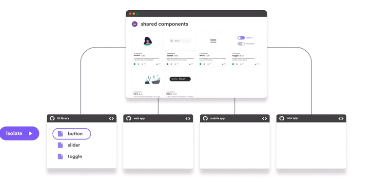
Tip: Use Bit (Github) to easily share and reuse Angular components across your projects, suggest updates, sync changes and build faster as a team.
Angular components with Bit: Easily share across projects as a team
Component Class Inheritance
My least favorite, but also the most used way to share code among Angular components, is ES6 class inheritance usingthe extends keyword.
ES6 class inheritance is seen as hugely controversial in the Javascript community for various reasons, but it is still incredibly used in the Angular world; when used in the right way and is not abused, the technique is a decent solution for sharing code between components.
Let’s see an example of extending a component with inheritance by creating a component ListComponent, extended by two more abstract classes that extend the functionality of the base class, and then we implement these with the actual Angular component.
A common way of using this technique is to create an abstract class and define there the methods shared by all the subclasses. A subclass may have to implement the abstract methods or override the existing ones.
ListComponent Base class
The Base class is very simple: we simply define the Input items.
export abstract class ListComponent {
  @Input() items: Item[];
}
Next, we want to extend the functionality of a simple list with pagination and selection. Therefore, we proceed and extend BaseList with two more abstract classes.
PageableListComponent
The component PageableListComponent extends ListComponent and adds pagination functionality.
export abstract class PageableListComponent extends ListComponent {
    page = 0;
    itemsPerPage = 2;    get start() {
     return this.page * this.itemsPerPage;
    }    get end() {
     return this.page * this.itemsPerPage + this.itemsPerPage;
    }    get pages() {
      return new Array(this.items.length / this.itemsPerPage);
    }

    changePage(page: number) {
      this.page = page;
    }
}
SelectableListComponent
The component SelectableListComponent extends PageableListComponent and adds selection/unselection functionality.
export abstract class SelectableListComponent extends PageableListComponent { @Output() selected = new EventEmitter<Item>(); @Output() unselected = new EventEmitter<Item>();
Finally, we create an implementation of the class CustomersListComponent and extend it SelectableListComponent. The template and the component will have access to all the outputs and inputs we specified in the other classes.
@Component({
  selector: 'customers-list',
  template: `
    <div *ngFor="let item of items | slice: start : end">
     <label>
       <input
         type="checkbox"
         [checked]="isItemSelected(item)"
         (change)="
           $event.target.checked ? select(item) : unselect(item)
         "
       />
      {{ item.display }}
     </label>
    </div>
    <div class='pages'>
    <div *ngFor="let p of pages; let i = index;"
         class='page'
         [class.selected]="i === page"
         (click)="changePage(i)"
     >
     {{ i }}
    </div>
  </div>
`
})
export class CustomersListComponent extends SelectableListComponent {}// USAGE
<customers-list [items]="customers"
                (selected)="onSelected($event)"
                (unselected)="onUnselected($event)"
></customers-list>
We can also create a subclass from CustomersListComponent, although the decorator’s metadata will have to be redefined. That means we will need to assign a new selector, template, styles, etc. to the new component. If you want to reuse them, then you can point the URLs to the parent class’:
In order to share logic between Angular component classes, we can also leverage a less-known method known as Mixins. Mixins allow us to compose multiple small classes that extend the target class but without having to use multiple inheritance.
An Example of Typescript Mixin
Let’s demonstrate what a mixin is with a simple example. First, we define a base class:
class BaseButton {
  label: string;
  disabled: boolean;
}
Next, we define a function that extends the base class with a new mini-class
function themeMixin(BaseClass) {
    return class extends BaseClass {
      theme: string;
    }
}
Finally, we extend the BaseButton class with the mixin:
class PrimaryButton extends themeMixin(BaseButton) {}
Building CustomersListComponent using Mixins
Let’s rewrite the CustomersListComponent example using mixins.
export function pageableListMixin(BaseClass) { return class extends BaseClass { page = 0; itemsPerPage = 2; get pages() { return new Array(this.items.length / this.itemsPerPage); }
changePage(page: number) { this.page = page; } get start() { return this.page * this.itemsPerPage; } get end() { return this.page * this.itemsPerPage + this.itemsPerPage; } }export function selectableListMixin(BaseClass) { class SelectableListMixin extends BaseClass { @Output() selected = new EventEmitter<Item>(); @Output() unselected = new EventEmitter<Item>();
While also Mixins have several pitfalls, this is, in my opinion, a more elegant and safer solution to multiple inheritance, at least in the long term.
Component Composition
The component composition is a technique that complements inheritance and mixins: instead of extending a component with more functionality, we can combine multiple smaller components to achieve the same result.
ListComponent: Leveraging the Power of ngTemplateOutlet
The first component we can create is a generic, reusable component ListComponent: its responsibility is to simply render the items based on start and end indexes as provided by the parent component.
As you can see, the component does not dictate how to render each individual item: we let the parent define that by providing ngTemplateOutlet and passing each item as context.
Then, we add a pagination component that takes care of listing the page numbers, and to notify the parent when the user clicks on a page:
@Component({
  selector: "pagination",
  template: `
    <div class="pages">
      <div
       *ngFor="let p of pages; let i = index"
       class="page"
       [class.selected]="i === currentPage
       (click)="pageChanged.emit(i)"
      >{{ i }}
      </div>
   </div>
`
})
export class PaginationComponent {
  @Input() currentPage: number;
  @Input() itemsPerPage = 2;
  @Input() itemsLength: number;

  @Output() pageChanged = new EventEmitter<number>();

  get pages() {
    return new Array(this.itemsLength / this.itemsPerPage);
  }
}
CustomerComponent
Next, we define a component to represent each item in the list: it takes care of defining how the item is displayed, and dispatch events when the item is selected or unselected:
It’s now time to put things together! We can reuse the previously defined components to compose a list of customers, that is selectable and pageable. These components are all reusable and can be composed with any other list.
Component composition is the ultimate way to create highly-reusable, clean, and effective components, and is easily my favorite way of thinking about sharing code and reusability.
Instead of writing God components, we can reuse many smaller ones. Getting right the public API of each component is fundamental for them to work well with the rest of your application.
As you can see above, we still have some repeated logic due to some methods being rewritten for each list we create: that’s why using one technique is not exclusive: we can easily combine this with a mixin that takes care of selection, so we do not have to rewrite it for other lists.
In this article, we went through three techniques for sharing code between components.
If it wasn’t clear by now, I am not a fan of inheritance and multiple inheritances, but I think it’s still very important to know and recognize when it’s a good idea to use and when it’s not.
In my next article, I will be focussing more on Typescript Mixins, which in my opinion is the least known and underrated way of building components. I will explore a scenario where inheritance results in brittle, hard to maintain code, and how Mixins can help, including cons and pros, and prior art from the Javascript community.
