Sunday, September 25, 2022

AngularJS Performance Tuning in Enterprise Applications


Before developing any application, it is always important to use the technology stack in a beneficial way. Using a technology doesn’t count until and unless we use it effectively.

Let’s see some of the common performance issues caused by AngularJS and their possible suggestions to fix or ways to avoid them.

Problem Faced or What Went Wrong During Implementation of Good Practices

From my past learnings and while working on AngularJS projects, I came to know few lags which I was making. This blog cover certain performance issues and possible suggestions to fix them.

Problem Area 1: parseHTML

The style and layout changes are applied by the browser in small batches. When batching is not possible, lagging is caused.

Too many DOM operations are costly.

Possible Solution Area 1: parseHTML

  • We must write inline templates in directive’s template property.
  • Angular’s built-in $templateCache must be prefilled with our own templates. Whenever we need an external template, the cache is checked by angular. Many grunt tasks automatically combines and minifies the HTML templates and prefills the AngularJS $templateCache

Problem Area 2: Slow dirty checking

There are two things in Dirty Checking:

  1. Recognizing changes
  2. Reacting to changes

We register too many watchers and the complexity of values being watched is high, hence recognizing changes can be prolonged. Also, we do too much in watch operation that reacting to changes can be very slow.

Possible Solution Area 2: Slow dirty checking

  • Use unregister function to unregister all the watches after using the watcher:
    var unregisterFunction = $scope.$watch(‘namehere’, function(){expression});
    unregisterFunction ();
  • $watch function with 2 parameters is fast. A 3rd parameter to $watch is also supported by Angular: $watch(‘val’, function(){}, true). This 3rd parameter lets Angular perform deep checking, i.e checking each and every property of the object. This could be much more expensive hence causing performance issue.
  • To solve this issue, $watchCollection(‘val’, function(){}) is added by Angular. This method is almost similar to $watch with 3 parameters, except that it checks only the first layer of object’s properties. This improves the performance to a great extent.
  • Use isolated scopes in directives and pass only necessary values/models.
    Recalculate and cache complex model changes and apply them to watch expression.
  • Pre-filter large collections and use the result as a source for ng-repeat. Only deep-watch if required. Deep-watching uses angular. Equals on each property.

Problem Area 3:  Many DOM operations

Accessing the DOM is expensive-

angular.element('div.elementClass')

Therefore, one should work using as few DOM nodes as possible.

For further reading, please see-

Mastering Web Application Development with AngularJS Chapter 11

Possible Solution Area 3: Many DOM operations

  • Wherever possible, keep the DOM tree small.
  • If possible, avoid DOM modification and do not set inline styles.
  • Use ng-if instead of ng-show/ng-hide.

The ng-show directive toggles CSS display property on an element, whereas the ng-if directive removes the element from DOM and reconstructs it if required.

ng-show/ng-hide-

<span ng-show='Age==18`></span>
<span ng-hide='Age<18`></span>

ng-if-

<span ng-if=’Age==18`> </span>

Problem Area 4: Code Duplication

For similar functionalities, we are in the habit of copy & paste the code.

Possible Solution Area 4: Code Duplication

  • Use custom directives

With Directives, we can create custom HTML tags, classes or attributes to execute required functionality on an HTML section. Then it becomes a reusable and independent component which can be embedded in HTML pages.

myApp.directive(‘myDirective’, function() {
 return {
  restrict: ‘E’,
  template: ‘<h1>I made a directive!</h1>’
 };
});
<body ng-app=“myApp”>
 <my-directive></my-directive>
</body>

For further reading, please see-

https://dzone.com/articles/angularjs-10-best-practices

  • There should be unique responsibilities for each task in a controller.

Standard code should be written up to a level that no if -else is required in case of any modification required in a module

Problem Area 5: Memory Leaks in Angular

Whenever we have a reference in a child scope to a higher node, a reference is maintained and all the subtrees are kept alive. This creates a memory leak. If we register a listener on a service or on a DOM node that is not being deleted, it creates a risk of memory leaks.

Memory leaks lead to performance problems as it slows down the applications and can cause process termination. In large applications, this is not at all good.

The most common reason for the memory leak in Angular is jQuery usage in the directives. When we attach an event-listener in the directive using a jQuery plugin, it keeps a reference to DOM even if Angular deletes its own reference to the DOM. This means that it would never be garbage-collected by the browser, i.e., “Detached DOM tree” in the memory.

Possible Solution Area 5: Memory Leaks in Angular

  • Remove bindings to avoid memory leaks.

Always unbind the jQuery event in the directive. Use $destroy method to clean up DOM bindings before removing an element from the DOM.

$scope.$on("$destroy",function() {
 $(window).off("resize.Viewport");
});
  • Always cancel $timeout timers in $destroy Events.
$scope.$on("$destroy",function(event) {
 $timeout.cancel(timer);
});

Other Workable Solutions

  • Avoid filter on ng-repeat-

Filters are very easy to use- insert a pipe, the filter name and it’s done. However, Angular runs every filter 2 times per $digest cycle. Once whenever anything changes and another time to collect other changes. They do not really remove the collection from memory, instead only mask filtered items with CSS. This leads to heavy lifting.

Instead of using a filter in ng-repeat –

<ul>
 <li ng-repeat=”data in bookData | filter:’A’”>{{ data }}</li>
</ul>

Use the $filter service in controller-

$filter provider should be used to run filters before parsing into the DOM. This pre processes the data before sending it to View, which saves the parsing of the DOM and knowing the inline filter syntax.

// controller

$scope.filteredWords = $filter('filter')($scope,bookData,  'A');

// HTML

<ul>
 <li ng-repeat=”data in filteredWords”>{{ data }}</li>
</ul>
  • Use pagination or infinite scrolling for lists (with ng-repeat).

Infinite scroll is a separate module of angular that you can use to implement infinite scrolling in AngularJS applications.

<div ng-app='myApp' ng-controller='MyController'>
 <div infinite-scroll='loadMore()' infinite-scroll-distance='2'>
  <img ng-repeat='img in images' ng- src='http://placehold.it/225x250&text={{img}}'>
 </div>
</div>

var myApp = angular.module('myApp', ['infinite-scroll']);
myApp.controller('MyController', function($scope) {
 $scope.images = [1, 2, 3, 4, 5, 6, 7, 8];
 $scope.loadMore = function() {
  var last = $scope.images[$scope.images.length - 1];
  for(var i = 1; i <= 8; i++) {
   $scope.images.push(last + i);
  }
 };
});

Benefits

Quantitative Benefits

Performance optimizations always bear the risk of increasing code complexity and therefore decreasing maintainability, by optimization we will be making AngularJS as a primary choice for development.

It encourages an individual to deal with models not only on the server side but also on the client side. Angular JS enables you to create software more quickly and with less effort. It has a 2-way data-binding, so saving it to the server now takes a smaller number of lines, unlike jQuery that requires creating your own object, and several different click and event handlers.

The Dependency injection and the ability to create directives in AngularJS has really excited the developer community. These features let developers create and share components very easily.

Qualitative Benefits

Angular is next generation framework where every tool was designed to work with all other tools in an interconnected manner. It is not merely bundling of existing tools, but the plugins are designed sophisticatedly to meet the purpose of each tool used.

1.) Data models in Angular are plain old JavaScript objects (POJO) which do not need irrelevant setter and getter functions. One can add and change properties directly on it and loop over objects and arrays. Due to this, the code looks more intuitive and much cleaner.

2.) Improve the testability of the software  AngularJS has dependency injection at its core, which makes it easy to test.  Even the documentation on the site of the portal has testing as a part of every tutorial step, which almost makes it hard NOT to test.

3.) This allows us to keep in mind the same object-oriented design principles that in general makes the software more maintainable compared to procedural which results in a software that is more maintainable.

Learning/ Improvements

Main application module should be in the root client directory. A module should not be altered apart from the one where it is defined because a module should be reliable if anyone wants to include it as a reusable component.

When writing web applications, we have objects at server-side that at times aren’t represented as objects at the client-side.  This might be OK for simple sites, but if it gets complicated, it can be an immense help to mirror these objects on both sides.

It gives elasticity with filters. Filters filter the data before reaching the view and can include something as simple as reversing the order of an array, formatting decimal places on a number, implementing pagination or filtering an array based on a parameter.

In applications like jQuery etc., the view presents data by modifying the DOM and adds behavior by manipulating it. With Angular, code for DOM manipulation must be inside directives and not inside view. Angular looks at the view just like any other HTML page with placeholders for data. This pairs perfectly with UI designers.

Applicability to Other Projects

Projects that are using AngularJS for the development of UI will meet these scenarios, by keeping our model clean and minimum number of watchers we will be able to optimize the performance with great ease. All the mentioned problems/solutions are applicable for any kind of AngularJS project and are handy for getting things done in one go.

Friday, July 22, 2022

The Most Effective Power BI Dashboard Tips and Tricks


Welcome to our roundup of the best and most effective Power BI Dashboard tips and tricks.

With Microsoft Power BI evolving each month, it is important to stay on top of it so you can use every feature to its fullest. In this tutorial, our CEO, Andrej Lapajne, unveils his best tips and methods for designing your dashboards, which will serve you well into 2021 and allow you to stay ahead of your competition.

Note: This tutorial is based on our 1-hour webinar on the same topic. If you prefer to watch the video, scroll to the bottom of this tutorial, enter your details and we'll send you the webinar recording and all PBIX examples to go along with it.

1. Keep it simple

Yes, really. We have noted that this can be quite a difficult hurdle to get over. Many times people try to use multiple features at once and they often fail because they just put too many things on a dashboard or just do it in a way that is not very user-friendly.

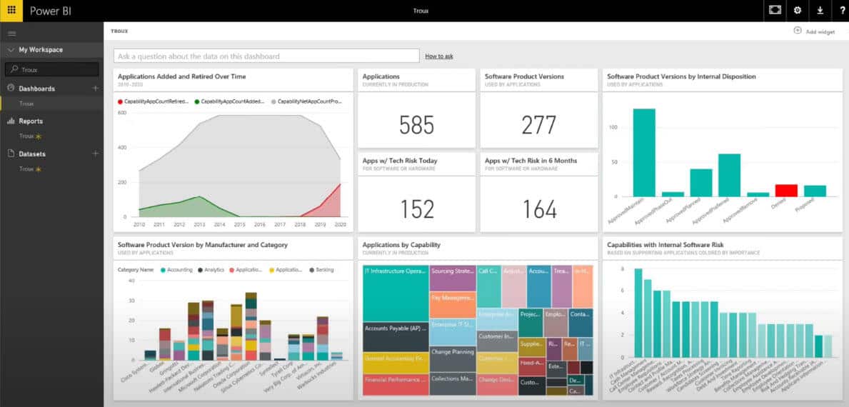
What you have to have in mind when designing dashboards in Power BI are the end-users. They are not necessarily Power BI ninjas and they will not necessarily find all the little features and click on all the slicers that you've put on your dashboard. For many of them, the experience of just consuming the dashboard can be quite overwhelming. Let’s take for example one of the default Power BI dashboard layouts.

Power BI dashboard tip #1: keep it simple

When you land on this page as an end-user, as a manager, it's really hard to understand, whether you are doing good or bad. Is the performance good? How good? Is it bad? How bad? Although they may have a lot of information, a lot of slicers and options, there is nowhere in particular to focus attention and it’s not very intuitive to find out how to get the details and the insights. With every tile, many more questions arise.

The two characteristics of great Power BI dashboards

You need to set two goals for the start.

First of all, your dashboards need to be understandable. You, as an end-user, need to understand what you’re looking at, you need to understand the data categories and everything that is presented to you.

Once you understand it, it needs to help you guide your attention and act upon it. They must become actionable. 

2. The layout

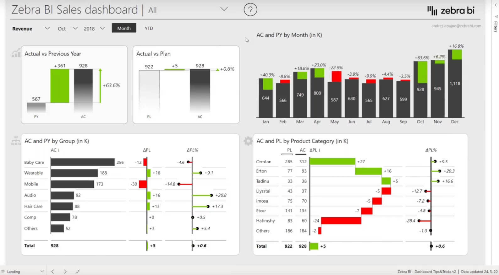
This is the Power BI dashboard that we built in the webinar:

Power BI dashboard tip #2: the layout

First, it needs to have a layout that people will understand. You should have a key KPIs on the top left part of your dashboard. Around it, you need to provide some context in order for people to understand. You’re more or less on the plan in October with your revenue, it looks like 0.6%, so right on the plan. This is good. So how did we achieve that?

The tiles around are the context that explains this. On a landing page, you want to keep your information short and sweet and especially focused on the most important data categories - the ones that have contributed the most to your end result.

3. Tooltips

Let's create tooltips that will "wow" your end-users. Note: This is one of our most popular Power BI dashboard tips, both with report creators and end-users.

First of all, you need to design a separate page, you can do so by pressing the "+" icon in the bottom. In our case, we named the page “tooltip”. You then put a chart onto the page and design it, and you need to make sure that the tooltip is not too big.

When you're designing, go to the “page information”. To make this a tooltip that will appear on another visual somewhere else, you need to turn on the tooltip option. This now means that this page can be used as a tooltip anywhere else on your dashboard and in your report. Then go to the page size and switch from the default to tooltip. 

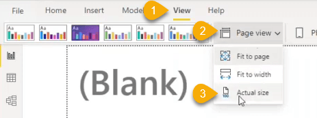
The image gets really, really big because Power BI always switches the pages by default to fit the page. So when you're designing tooltips, make sure to then switch the page view to the actual size which will give you an idea of how much real estate you actually have.

Limit the number of items

Now, it's really important that you don’t put a lot of elements in this little chart since you don't have a lot of space. So it is best to make sure that you present only the most important information in the tooltip. 

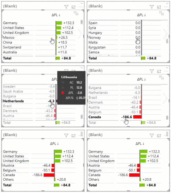
One of the best ways to do this is to use the top N feature in Zebra BI. For example, you have a lot of variables, in this case, countries. There are some countries that have contributed very positively to your results. Then you have a lot of countries that are more or less on the plan, so you don’t need to concern yourself with them since there was no variance. But then, at the bottom, you still have some countries that are, again, very interesting because they had a really big negative variance.

So we would like to show only the most important information, so the countries with the biggest variance. Under categories, you can enable the top/bottom N, where you have several options. Because we're doing it for the variance, we select top + bottom N, which means that Zebra BI will automatically take, a certain number of the countries that have either positive or negative variance.

You can choose the specific number in the “Items” field. So we actually calculate the absolute value here. What’s great is that everything else is automatically summed up in the “others” elements. Zebra BI automatically adds to this shortened data set so that the grand total is actually the sum of all of the elements. This is quite important. Now you will always have the best performing and the lowest-performing countries.

Adding the tooltip to a visual

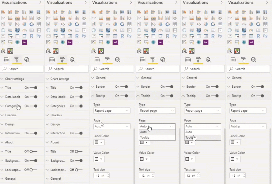
Now you have this short tooltip you can just add it to any visual you want. You can go under “Visualization” settings and then select the “Tooltip” section. The “Page” field will be “auto” by default, which results in the basic black tooltip that it's not really helpful because it just shows you the data that you already see on the visual, so it's not very useful. So you just flip the field to the tooltip page we created earlier. This is actually the name of the page that we earlier enabled to be used as a tooltip. 

Make tooltips "smart"

All right. Now, if you have a business unit that has a negative variance to plan, you want to know why. Here, when you hover your mouse over this variance, you get the breakdown of the countries that had the biggest impact, either positive or negative, that contributed to this total variance in this business unit. These are the smart report page tooltips. 

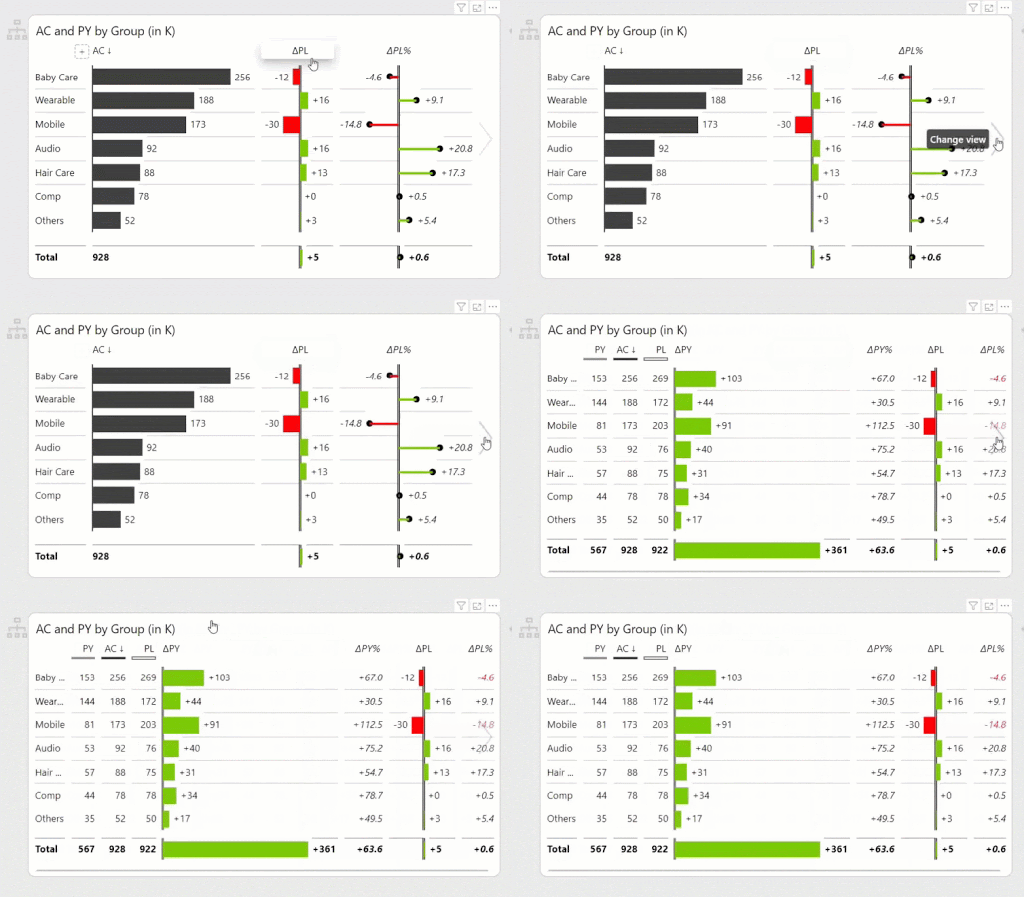
The next thing is how do you do the interaction? When you want more details, you can simply slide on the right and now you'll get more information, like the values, relative growth and absolute growth from the previous year.

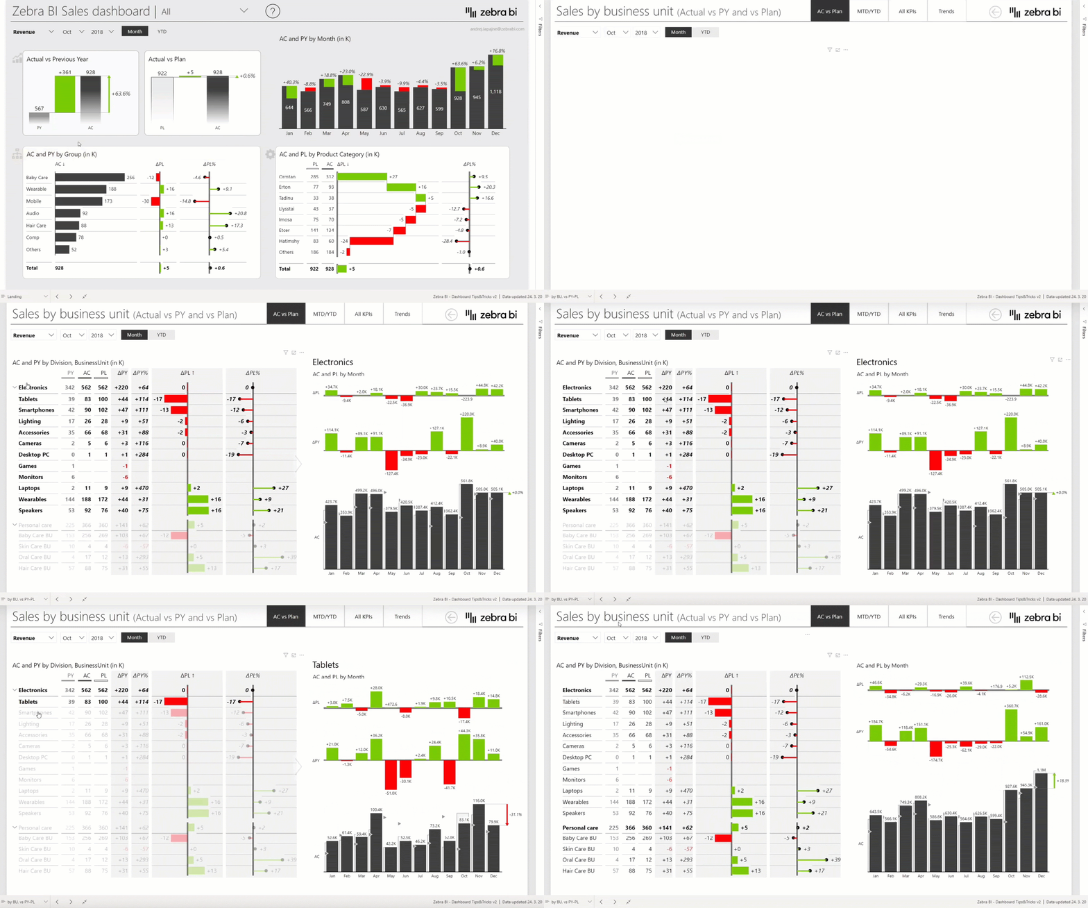
But this is still not enough. What you can do, is to simply click once and dive into a detailed report on business units. Just one click and now you go from the first overview landing page to a detailed report.

Tip: Provide a view that is more visual and contains less information, but then allow the user to just click once and get all the details

4. Dynamic chart titles

Now this detailed report, of course, has all the business units. These business units are structured so you have a hierarchical table that you can expand and collapse and see all the details. There's a little dynamic title that helps end-users understand what they are looking at. 

Power BI dashboard tip #4: dynamic chart titles

Because Power BI allows heavy filtering, cross-filtering, slicing and dicing, the end-users often have a problem since they don't know what filters are enabled at a certain point in time. So it's nice if you're able to just add dynamic chart titles that will expose the filters that are enabled. 

5. Page navigation

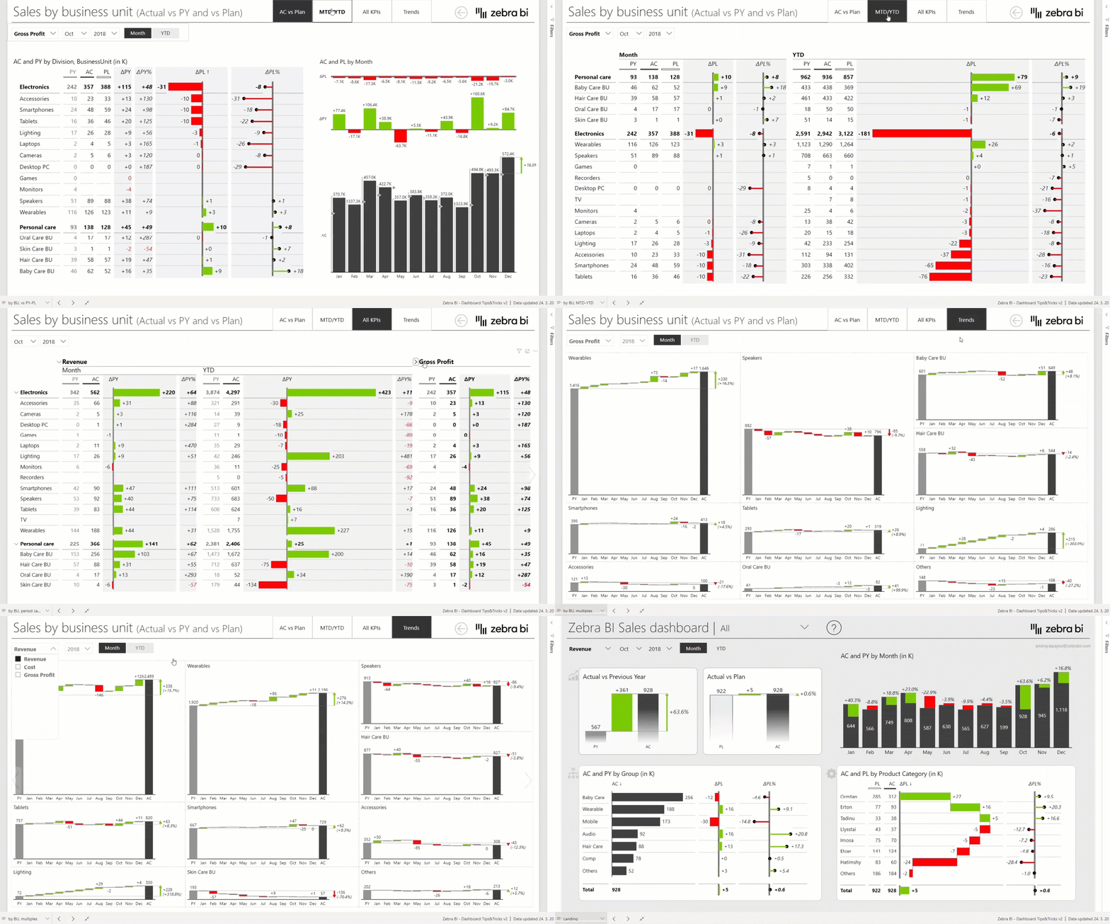
Of course, you can now have several ways how to present the information on your business unit. You can, for example, add another view, something like a tabbed page navigation. These are just native Power BI buttons with very simple page navigation and they all refer to your business units report.

Power BI dashboard tip #5: page navigation

On the other hand, the slicers enable you to simply click and switch different types of use. These slicers use DAX tricks to change visual dynamically For example, revenue, gross profit, trends, etc. Still, they are all about my business unit.

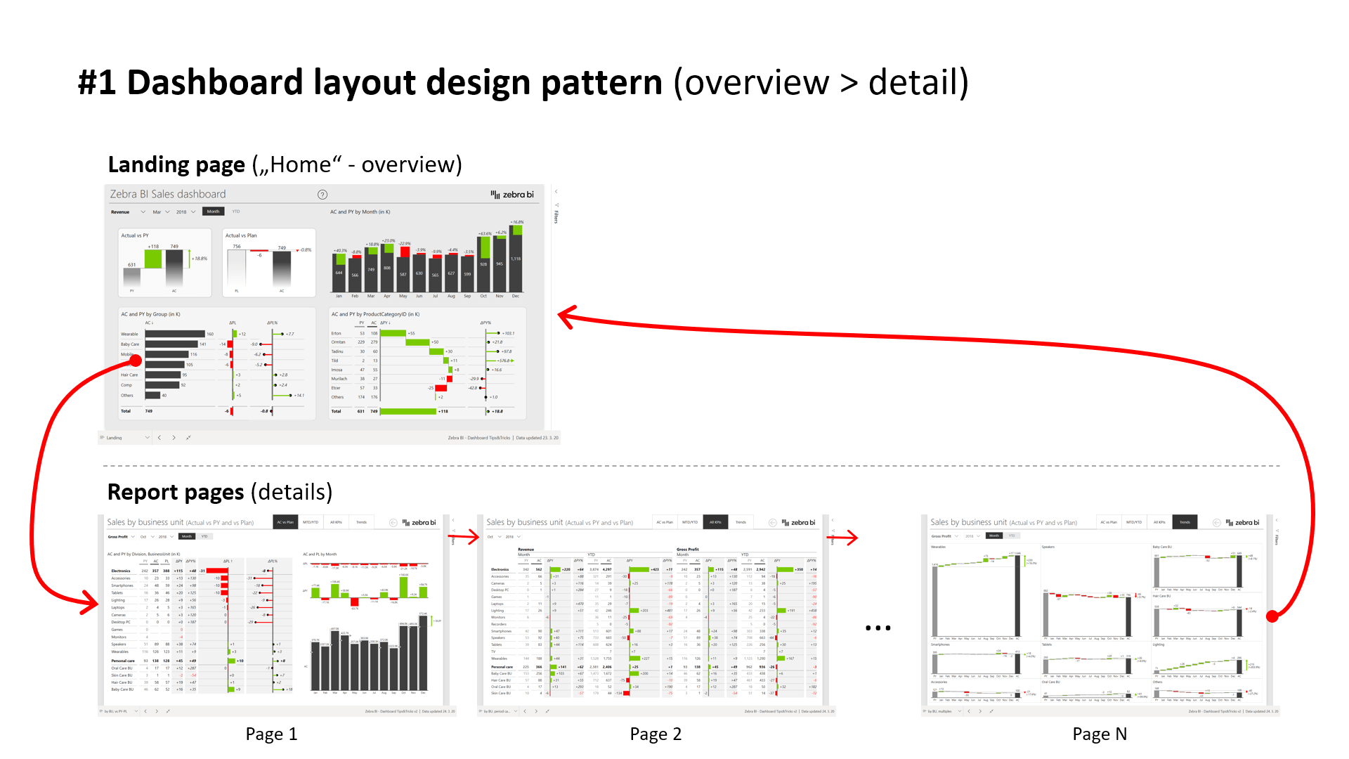
Once you understand the situation, you have some sort of navigation that brings you back to the landing page. This is called a two-layer master-detail or overview detail design pattern for dashboards that we believe works quite nicely. First, you have the landing page and then you allow users to navigate through the landing page to the detailed report pages. So this is kind of the basic pattern that we are striving to use all the time.

6. Buttons

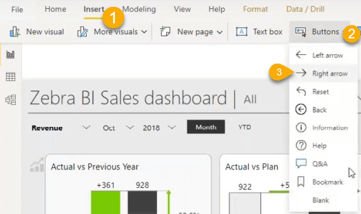
Buttons are very, very simple in Power BI, especially with the latest version. You can insert a button on the top bar and there are different types of buttons you can try. The right arrow example is the same button we have used here as well.

Power BI dashboard tip #6: button navigation

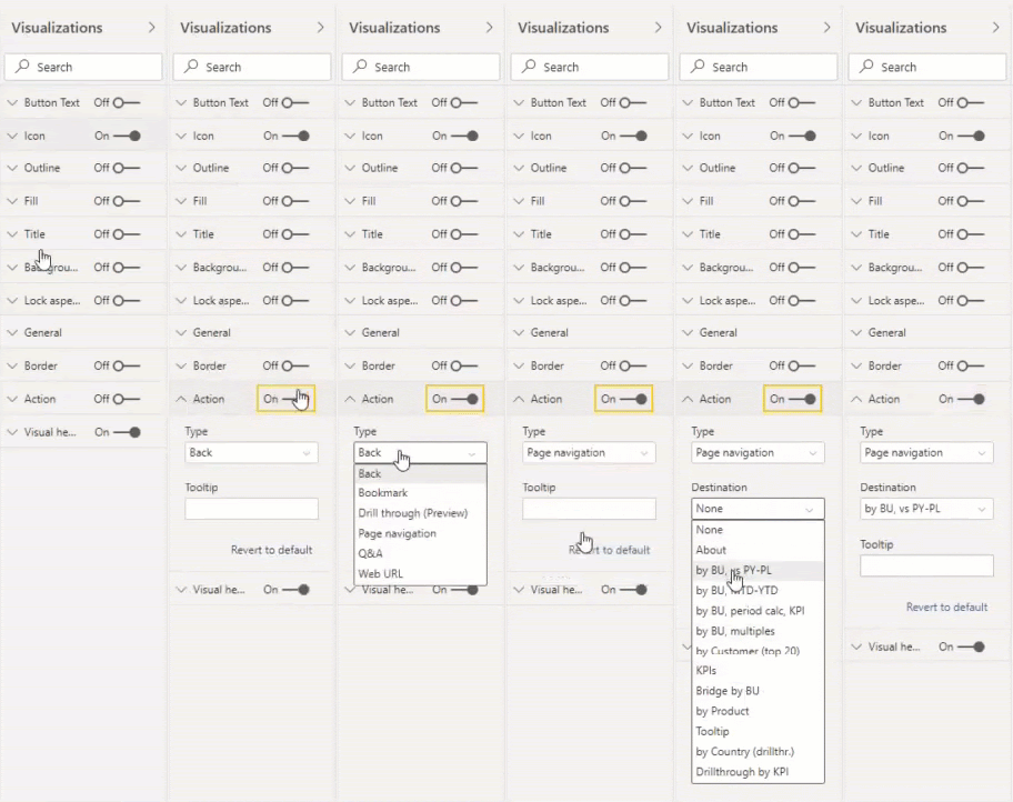
The most important property of this button is the action, which determines what the button should do.

On the right side, under “visualization”, you have a group of settings called “the action” and you can choose from a few types of actions. We mostly use “page navigation” in all of the Power BI dashboards that you can see in the webinar.

After choosing the type you must also choose a destination. Simply select the page that you want this button to lead to. In this case, this is a report by a business unit. And so, the user can now click on this created button and they will arrive at the determined page. 

Trick: place a button over the logotype

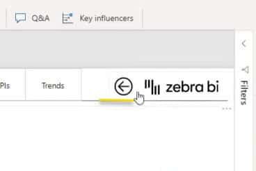
Then you can allow users to go back to the landing page, which can be done by the arrow on the top. 

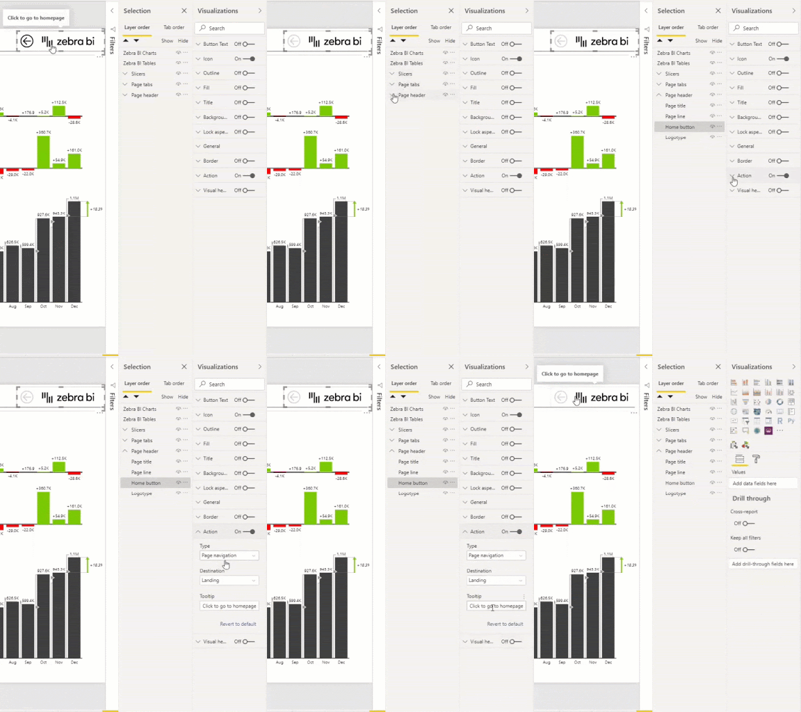
In this case, we have actually placed this “home” button on top of the logotype. You can override the logotype button by adding another button on top of it. This is all a part of the page header, which you can further manipulate on the right. As you see, the logotype is below the home button, which has the action. We have used fixed page navigation and then the destination is back to the landing page, so you can go back. 

You can use the same method to create a “Drill through” button and the tabs for Trends, all KPIs, etc.

Designing the buttons

Now you can design each button. For example, we have designed a button to be invisible, but it becomes visible again when you hover with your mouse over the title in the visual. 

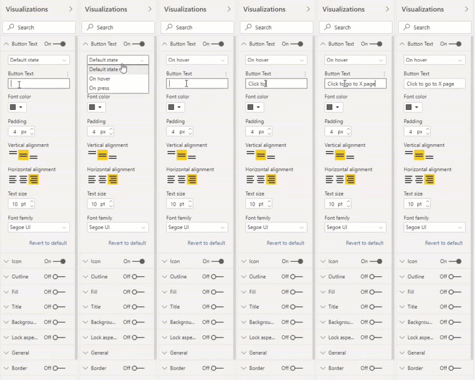
How do you do this? On the right, under “visualizations”, you can edit features, like the state, which is the most important in our case. If you just type the text while the state is the default, this means that the text will be visible.

If you want to have an empty button, then you first switch the state to “on hover” which means when the user will move the mouse on top of the button, it will become visible. Now you can type the text you want, for example, "Click to go to the next page."

It is important that you leave the text field empty while the state is defined as “default”.

You can also edit other properties, like font, colors, and alignment of the text.

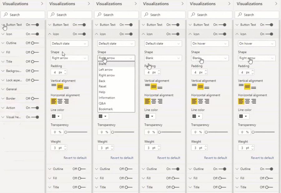
The icon can also be made visible only when hovered over it, by using the same principle as with the text. Under where you edited  “button text”, you can also edit “Icon”. While in the “default” state select the blank shape, and while “On hover” state select the right arrow.

Now the entire button is invisible unless you hover over it. Again, you can edit other properties of the icon.

7. Help tutorials

OK, you've reached the most important of our Power BI dashboard tips!

The is the part of the dashboard that we are most proud of. It also took the most time.

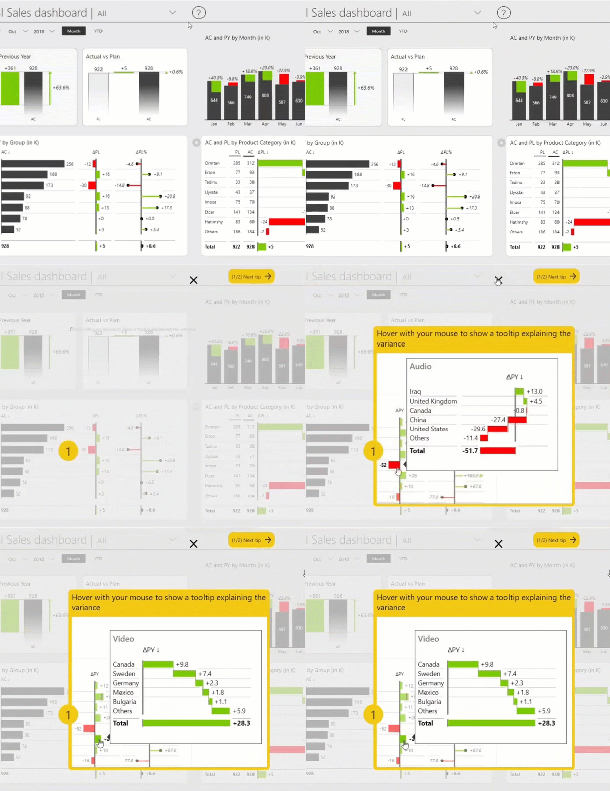
When you click the help button, you get help tutorials that will assist end-users in understanding how to use the dashboard. 

Power BI dashboard tip #7: animated GIFs

Clicking on the question mark button has dimmed my dashboard and has provided some helpful tutorials on top of my dashboard. 

How do you do this? This one is a little bit more tricky but, in essence, the button has an action, like before, but this time you’re not navigating to another page. Instead, you’re making some visuals visible. Those yellow pages and those images with the videos are actually on my page but they are not visible by default. 

Showing a comment in a text box

Let's do a simplified example of that first, like a text box. You can do that by clicking the “insert” tab and then “Text box”. You can edit it to your own preference.

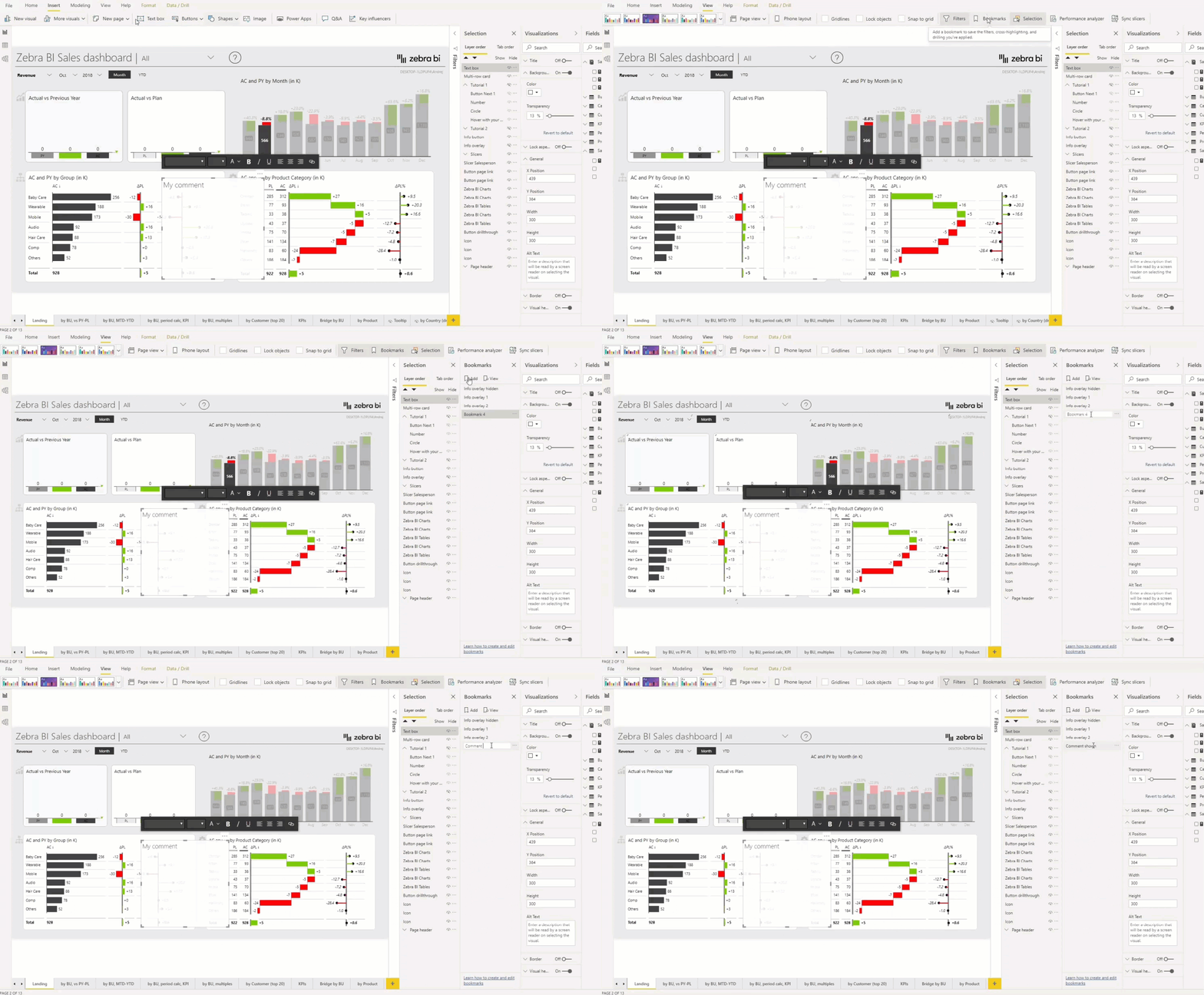
We want this element to appear on top of my dashboard when the user will press a button, which you can do by adding a bookmark. Navigate to view and click on bookmarks. Now you can add a bookmark and you can rename it by double-clicking. Now, Power BI has remembered this new bookmarked state. 

If you go back to the previous, initial state, you then hide the text box. Now that this comment is hidden, you can add a bookmark for this state with the hidden comment as well. You now have these two states, the two bookmarks, one with comment shown, one with it invisible. 

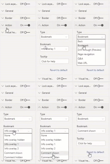
What you want to do for this button, is to simply invoke the bookmark where the comment is shown, and you do this by selecting the desired button, for example, the “help” button, and going to the “action” on the right, under “visualization”. You select the type “bookmark” and select the “Comment Shown” bookmark you just created. If you're in Power BI Desktop, then you need to press control + click on the button. And so the button invokes the bookmark, comment shown.

Tip: Of course, now you could make another button, like the X button and do the reverse thing - make the comment go away once clicked. 

Adding the background overlay

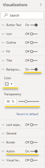
Another element in this example is making the background, the dashboard, grayed out. This element is actually a huge button with an enabled background. We have used the gray color and put the transparency to 36%. So it's a simple, overlaid rectangle that is slightly transparent and gray. 

You can use a text box for that or any other shape or a rectangle. But the button is actually the best way to do this because you can not only do it gray and transparent, but you can also tie an action to it to close the whole tutorial. Because this is a huge button, the user can click on it which will trigger this action and the action is a bookmark where the overlay is hidden, which brings me back to my default state without all of those tutorials and elements on top of my dashboard.

Adding animated GIF images

This is the best part of this Power BI dashboard tip.

Let's show the "help" animated GIF one more time:

How did we do this? We've used a trick here to actually put small videos that are actually animated GIF images embedded in the Power BI report.

You can click on the next tip and you see again another GIF that, of course, we have recorded beforehand and then we included it into this help feature of the dashboard here.

You can then just simply click anywhere to close the help section, and you're back to your dashboard.

But, there's a problem.

Sure, Power BI allows you to add images. But if you add animated GIFs, Power BI will not play them when inserted as an image element.

Note: If you just simply add a GIF image in Power BI, it will not be played.

So you need another trick to make an animated GIF play automatically.

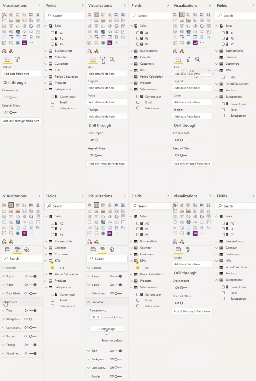
The way to do that is first to add a native chart, it doesn't really matter which chart. Now you can go to the settings and input some data inside. It really does not matter what, you just need to put it on the axis, preferably something really short.

This will allow you to access other settings of the chart. What we are interested in is the “plot area” where we can add an image.

So this is the workaround. It's kind of messy but that's probably the best way to add animated GIFs to your Power BI dashboards.

8. Negative KPIs

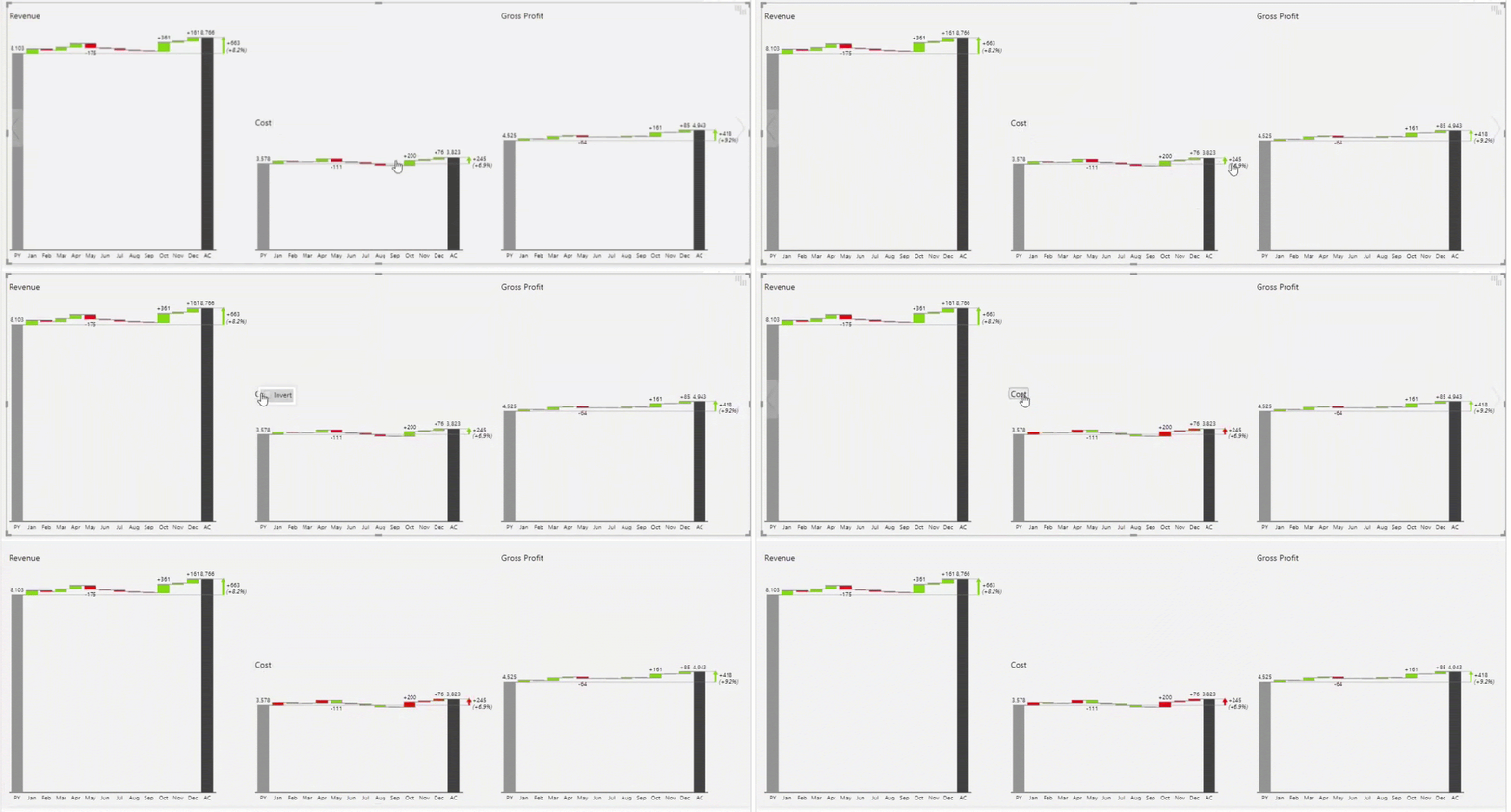
Another smart feature you can use with Zebra BI Custom Visuals is to use the inverted presentation of a chart. For example, on the KPI page we can see that the revenue is growing, the gross profit is growing, but the costs are also growing. Growing costs have a negative impact on your final results. That's why the cost element in your chart needs to have an inverted logic. In Zebra BI you can right-click on the title of one chart and you just click invert. This is a nice tip on how you present your KPIs.

Power BI dashboard tip #8: Negative KPIs

9. Small multiples

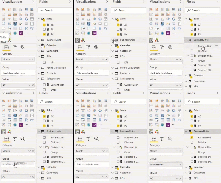
Let's add business units to the group field by drag-and-drop method.

Power BI dashboard tip #9: small multiples

Now we sales data in waterfall charts for all of the business units. Let's extend the visual:

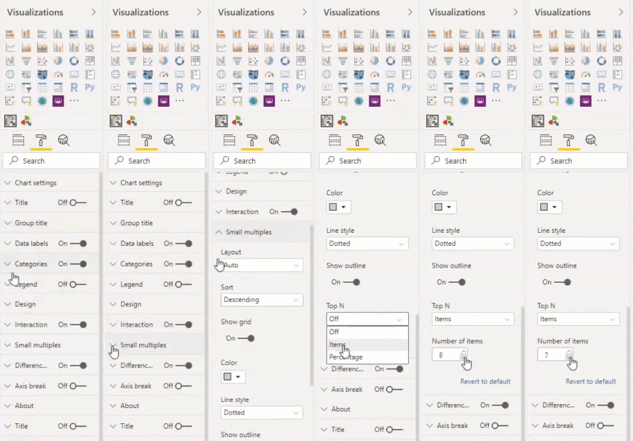
But you have a lot of small elements that are not so important. So the top N feature is really important here. You can do it by, for example, just stating the number of elements that you want to display:

Then you see the most important elements and everything else is summed up into the “Others” category. This is how you design detailed pages while keeping the user in mind.

Learn how to supercharge your Power BI dashboards with small multiples →

Image Classification: State-of-the-Art Models in 2025

Introduction Computer vision has undergone remarkable advancements in recent years, with image classification remaining one of its most fund...