Today we are adding a new image component to our re-usable responsive component library. We've named the image component "imagur" and it allows text to be shown on top of the image, while being 100% responsive.
In a folder named Components, create a new component "ng g c Imagur"
In the html type in this markup.
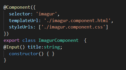
Change the typescript to this:
Here we shorten the selector name and provide a title input field.
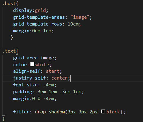
Next, we start work on the css for our ImagurComponent.
The ImagurComponent is a grid, with one row 10em in height. Its margin provides a gap of 1em to the right. The specific text markup was determined by using Chrome's device mode, going through all devices, and tweaking settings to find the optimal values for where the text was to show for each device.
Next we needed to style the image itself to achieve responsive behaviors.
Ng-deep was needed for the img CSS, to break Angular's View Encapsulation rules. Note that the text and image were both assigned to the same grid area.
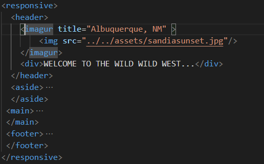
If the image is indeed in the assets folder as the first image shows, we are simply injecting that HTML into our ImagurComponent. Where the CSS takes over in image placement and text positioning.
Take Away: Using only the HTML 5 grid we are easily able to create a responsive image container that allows text to be overlayed.


No comments:
Post a Comment